Tag: architecturestudent
Studio Home Proposals
Hey everyone,
Now, I’ll mention about the first proposals of my final project of this semester. It consists of just my first ideas. First of all, I wanted to make interactive spatial conditions in my house. The previous scenario wasn’t changed, still there are two permanent subjects: industrial designers who design small decorative furnitures. I didn’t want to isolate housing and working area. I tried to make an very experiential space. I want people and spaces have relationships between eachother by means of transparent surfaces and different rectangular forms. There is one common space in the open space (courtyard). Privacy in this house is approaching to this experiential space. The all private areas make a connection with this space. So, it creates a circulation between working and living spaces. By the way, in the east part of the ground level of this house there is a continuity and transparency throughout the that zone. So, users can always have a control of their house and experience during the whole day. The other details of these ideas are written in the diagrams.
Here, there are some drawings and diagrams of my proposals that I presented in the first pre-jury. (The scale of all drawings is 1/200)
This the site plan:
Plans;
Elevations and sections;
This is the concept model;
There is a densier condition in my composition.These densier conditions have effects on the side spaces.
Kayakoy Workshop
Hi there, some weeks ago we went to an excellent village located in Fethiye in Mugla. It’s an amazing city and it is near the Ege Sea. Village’s name is Kayaköy. It consists of two different settlement. There are many historical houses there which were built in 19th century. They were set on the slopes and they creat a great view!
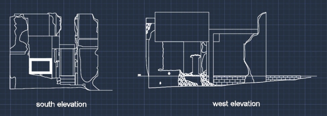
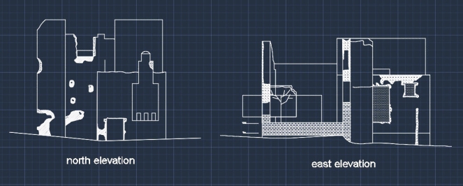
When I talk about why we were in Kayaköy, we went there to learn how to make a relievo of an old building. First, we drew just it’s outline without measurement and then, we used some different tools to measure the exact dimensions and levels. When we came back to school, we redrew them in AutoCAD.
After that our professor actually wanted us to produce a restaurated structure in an really old building. We didn’t touch the original and existing construction. If you remember the our final project of this semester, we tried to make a workshop for our industrial designers who comes from our scenarios. We assumed that they go to Kayaköy to work for four months. So, we tried to design a workshop house for them according to existing spatial conditions.
Here there are some photos of the house that our professors chose;
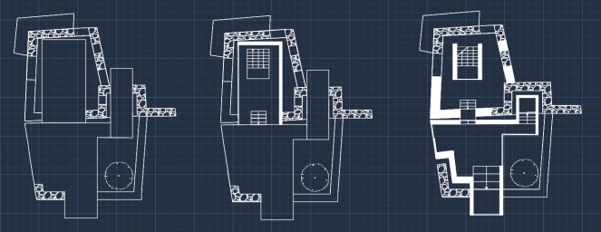
In my proposal, the construction that I designed is located inside of existing structure. I used concrete walls and glass which enclose inside. I didn’t use any methods of completing the existing walls or other elements. But, I use the information of that old building. For instance, I extended the structure in hollow parts of existing building. And also these parts create another and experiential space in outside. The whole structure consists of simple rectangular forms. In the entrance there is a huge box which is transition space; staircases and it’s surface which is front of the studio parts is transparent to make a visual sense and interaction with that working area. Also, there is a terrace in the service space of old building. In this space at the ground level there is also open space; courtyard. By the way, I used sliding and transparent door not to prevent transition spaces and to create a continuous permeable spaces.
These are the plans of each floors, elevations and section drawing;
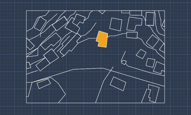
This is the site’s plan (vicinity);
A Modern Dynamic Structure: Milwaukee Art Museum written by Leyla Yildiz
A Modern Dynamic Structure: Milwaukee Art Museum written by Leyla Yildiz
There is an impressive building in every sense in the world. An outstanding creativity was used on this structure. It’s a spectacular product of high technology and genius engineering. In addition to this, it became a very artistic work rather than being just a structure. Besides, it’s an expression of movement and change. It’s form is alive and dynamic. Thus, all of these descriptions indicate one building which is Milwaukee Art Museum. It was designed by Santiago Calatrava. It is located in Milwaukee, Wisconsin, USA. This museum receives thousands of visitors in every year. Interestingly, it exhibits it’s own structure as well as exhibiting many historical and cultural artifacts. This museum has a coast on lake Michigan and it has a very well coherence with it’s environment.
Originally, the structure of this museum was built as just two-floor and a war memorial by Eero Saarinen in 1957. This very modernist architect used space dramatically. After that, David Kahler created a bigger space for this museum in 1975. He connected the museum to the city with a concrete bridge. Then, Calatrava designed a new addition which is called Quadracci Pavillion inspired by soaring birds, sailboats and the lake in 2001, which links to a boulevard with a pedestrian bridge.
Spanish architect Calatrava is also a civil engineer, sculptor and painter. Actually, on this amazing structure there are many effects of his engineering. Because, it is not just a common building. It shows the dramatic combination of architecture and engineering. Moreover, it refers to many artistic sculpture. According to a resource, Calatrava always wanted to find the statement of dynamism and make forms movable and changeable since his childhood. He tried to think of ways to give sense of movement to the objects and solve this paradox. He wanted to design dynamic and collapsible structures rather than following the fixed architecture rules about being stable and steady. This structure shows many impressions of art and natural forms. For instance, it looks like the forms of foldable bird wings designed by Leonardo Da Vinci. Also, it has many resemblances of human arm.
When we mention about the whole building, it is a really compatible construction with it’s context. It has a number of facts about sea inspired by the locaiton which is to the lake. It looks like yachts and sailboats, and also it’s steely wings remind flying seagulls. The movement of steel wings indicate sea wave. Moreover, the form of cable bridge looks like a sail. Then, it’s color is same with the seagulls, sails and has a relationship with the surrounding structures.
The whole structure consist of white steel and concrete. Steel is the most durable element in construction materials. Therefore, wings, bridge and the other structural systems are connected to eachother in a very strong way. There is a suspended bridge which connects to the pavillion and gets support from it. This design of bridge refers to very basic structural shelter tents. It uses tension and stress forces. In this bridge there are compression forces on the steel pylon and deck to the foundations like the pavillion. Also the steel cables (tension elements) stress the bridge. Thus, it becomes durable. Besides, there is an abutment like boomerang which resists the suspension bridge’s pulling force. Framing of glass ceiling and building spine rest on the pavilion and the back stay beam. The leaning elements on the glass framing (wings) are connected to the building spine. And then, this spine and the bridge’s pylon are parallel to eachother. They are bending 48.36 degrees towards to the pavillion.
On the glass ceiling, brise-soleil and movable elements were used. It looks like bird’s body. There is a spine in the middle and two very flexible wings are attached to it. Each of these wings have 36 rectangular sticks. They are also made of steel element. They are framing the sun light. It changes it’s own angle according to the sun. A hydraulic system in the middle controls these wings. They moves according to the external forces like wind load and thunderbolt. When there is a really strong wind, the wings roof the glass facade. These steel wings create a very nice ambience (light and shadow) indoor space. And also, these wings break the greenhouse effect that glass surfaces create inside. This ceiling were made of huge and curved glass surfaces which are supported with steel elements. Besides this facade gives a very well landscape to the lake.
The load transportation in the pavillion building is like on this cross section’s sketch.
In this image, some forces and other important structural processes were clearly showed. Red color indicate the largest bending moment on the structure. Green diagram shows where shear forces are at the highest level. And the all load transportation and forces were balanced in a very genius way.
This structure is very functional. It has many public spaces in a very well design. There is parking floor in underground. Then,in the lower floor, there are some meeting space, terrace and restaurant. In the main floor, there are many different spaces like reception hall, exhibition hall, lobby and terrace. It’s also ground level. In the mezzanine floor (Calatrava’s additon) there is a connection with the bridge. There is lobby, board room and existing galleries. All these exhibition spaces, terraces, cafes, stores, auditorium and parking area create very useful and equipped public space. Besides, under the bridge a public space (like a garden) was created. People can use also this area.
To sum up, Calatrava designed a very dramatic structure by using the convenience of the context, his extensive engineering knowledge and artistic skills. It looks like a flying bird to the lake. It has very emotional sense. To my way of thinking, these kind of architecture works and arcihtects should be encouraged and supported. Then, the structures arround us could be very modern and inspirational rather than being very common high buildings.
References
Greene R., (2013), How Santiago Calatrava Blurred The Lines Between Architecture and Engineering To Make Buildings Move, Archdaily, Retrieved January 3, 2015 from http://www.archdaily.com/321403/how-santiago-calatrava-blurred-the-lines-between-architecture-and-engineering-to-make-buildings-move/
Calatrava’nın Kanatları, (2010), Mimdap, Retrieved January 3, 2015 from http://www.mimdap.org/?p=44610
Nichols, A., (2004), Example Case Study: Milwaukee Art Museum, Retrieved January 3, 2015 from http://www.solaripedia.com/files/979.pdf
Quadracci Pavillion, (n.d.), Milwaukee Art Museum Info, Retrieved January 3, 2015 from http://mam.org/info/details/quadracci.php
Architecture, (n.d.), Milwaukee Art Museum Info, Retrieved January 3, 2015 from http://mam.org/info/architecture.php
PS: The hand sketches are belong to me. The other images and Leonardo Da Vinci’s drawings are from google images.
The analysis of a construction site: Anatolian Organized Industrial Zone; Administrative building
Hey everybody!
Today, I want to mention about a construction trip and my observations. Two weeks ago, our professor Onur Yüncü who is the lecturer of Arch 241 course took us to a construction yard. This construction is located in Anatolian Organized Industrial Zone in Ankara. It consists of complex buildings. We observed it’s administrative building. It’s architects are Onur Yüncü and Ayşen Savaş. They are really successful architects and they have worked for METU for many years. They have many awarded projects. Onur Yüncü is working for TEDU now. He is one of our professors in college. This project was designed in a year and it has built for one and half years. Let’s talk about this building.
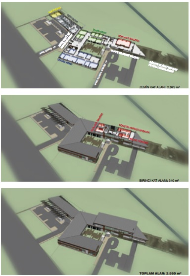
This building was designed for management, actually it’s kind of a main building of that zone. It’s a really observable structure to understand constructional system of a building because the structural processes and other stuff are transparent and obvious. This building is located in a very natural area. It has gren environment. Also there is small lake. That’s why, the users wanted architects to design a nature compatible structure rather than the other high and common official buildings. Actually, the users wanted a single-floor building which looks like a ranch house. But, architects realised that they need one more floor up in a part. This building consists of three parts. Actually they have just one single floor except one part. It has three floor. One of them is underground floor. Also, it has one more floor up because there is an administration part and there are some chairmans’ offices . That’s why they need to be in higher part of that building. In the first floor, there are many offices, convention halls and some meeting and entrance parts. These parts create a U shape. Then, there is a courtyard between them. The another part next to the others has dining hall, kitchen and also there are some important rooms which have the systems of electricity, heating, water and other stuff. Here, there are some images of this project.

These images are from
Click to access OY-M_Tanitim_2014-02_web.pdf
When we talk about the appearance of the whole building, it looks modern and more natural. It hasn’t many glass surfaces. It has some wooden elements, so it creates a natural and warm view. It looks like a house. The whole building is sitting on the stone floor. On that, there are reinforced concrete columns and then wooden roof. The whole structure is displayed as visual. Processes aren’t hidden. Besides,the huge horizontal facades were balanced by using some vertical wooden surfaces. These stone and wooden elements are harmonizing with the environment. There are many basic rectangular elements which consist of glass, wooden and other surfaces. So, there is always a continuity on the facade.
Inside of the building, we could observe the structural system easily. This building has two different structural system. One of them is scissoring in the main part and the other one is classical post structure, also it has just a concrete ceiling. From the protocol to ther other part, this system is changing. And this transition is visible, one is beamed flooring (with wooden) and the other one has no beam. Concrete combines with the scissoring. It also show the transiton between single floor and two-floor structure (except underground floor) There are also hinges between two different parts which are sitting on the different places (topographical). The hinges which are between two different parts are called dilatation like separating (called ‘dilatasyon’ in Turkish) It consists of foam. The wooden beams carry the roof and also there are some another beams which support the main beams (bearer). They are called ‘aşık’ in Turkish. They generally passes frequently and they are not strong and thick like the main beams. On the wooden ceiling there are some kind of heat insulation and roof tile. Besides, the carrying system built and designed that building, and some walls end somewhere according to the this system. So, all spaces were controlled and designed with this system. Moreover, this structural system repeats and then it creates a rhythm inside. By the way, inside of the building wooden element also was used for some coatings and benches. Some electricity cable and kind of these stuff were hided with the wooden covering. And some walls were built with red bricks. So all of them create a warm space inside too.
Beams
Dilatation, separation between two different part
The thickness of the columns are generally 35 cm. And they located in horizontal direction with some gaps 5 or 7 metres. And this process repeats after every 4 metres in other direction. When the height of the building increases, the thicknesses of the columns also increase. Also, the lowest one is 2.5 metres and the highest one is 3.5 metres. These tall columns are near to the entrances from parking area and courtyard. They, create the monumental appearance in the entrance.
Besides, when every surfaces end, there is always a gap (hinge) between the other surfaces. For example,when a column end in the roof there is a gap between them. It is the same with the ground. Also, hinges show the differentation of materials and surfaces.
Glass surfaces in this building make the spaces wide and sunlit. It can easily use the day light. Also, people can experience the natural environment when they are in this building. In the corridor between the dinning room and other parts there are some windows which were located in different elevations on the wall. So, all of them create different experiences. Besides, dining room was located in a very far from the protocol part because of the food smell and also, it was surrounded with glass surfaces. So, this situation doesn’t make this space closed and it looks light-well. By the way, in some rooms there are some inside windows. They provides privacy and create a connection between the other spaces in the building. For instance, during a meeting people can close this window with sliding wooden surfaces or they can observe the other when it is open. The offices in the second floor have also huge glass surfaces. These rooms have small resting rooms and bathrooms. In front of these offices there is terrace which looks to the small lake. So it creates a very well view. By the way, in front of the assembly room there is huge space. So, they provides a resting and waiting opportunity.
Besides, there is an also extension from the first floor of the protocol parts. It’s direction is also to the lake. There is a connection between this balcony and outside with staircases.
The courtyard between the U shape will be a warm space with wooden. The iron elements will be covered with wooden and then water can flow between the wooden element then it will flow from the concrete floor to the land. By the way, in the entrance of the protocol part there is a well designed and modern staircases. It’s a really dynamic element, and this part is trying to a make a sense for the entrance. This is really important.
By the way, the main entrance with a hall opens to the parking area. So, people can easily pass to it. When we look at the whole building, it is obvious that it remains it’s naturalness and coherence with the environment.
Exhibition: Sivil Mimari Bellek Ankara
Hi everybody;
Today I’ll mention about my observations which talk about an useful exhibition in Ankara. It’s a great work. It’s name is ‘Sivil Mimari Bellek’ and it was exhibited in Çağdaş Sanatlar Merkezi . People from Başkent University with the supports of TÜBİTAK and VEKAM have done researches for 3 years for that. These studies are about civil architecture in Ankara. The years between 1930 and 1980 were considered. This period is extremely important because, the structures have featured significances. Project team worked on 120 buildings which represent many different architectural aspects and development of modernization in Ankara. Actually, it also show how architecture get change and it’s evolving in history. The objective of this study is that remarking on residential buildings, making their architects known and then revealing the cultural qualities and their contributions to inheritance in architectural sense. There were many photos, technical drawings and texts about these buildings on the sheets,some models. Classification in terms of periods was considered on it. With these works, the values of these constructions can be permanent and thus, the memory of civil arcitecture can be protected.
Now I’ll talk about my observations considering the stages separately. Let’s start with 1930s. This stage is a part of early republican period. It is really important, because it is a transiton time from the Ottoman to Republic Period of Turkiye. So, this stage has first modern and contemporary attempts in architecture. First, the structures have simple facades. There aren’t any ornaments on them. They are basic and unique buildings of modern period. When we look at the first half of 1930s, it is clear that this period is a really passing phase, because it has still the qualities of Ottomon architecture. It’s like a synthesis of these two different periods (Ottomon and Republic) They have some circular forms on their facades and inside. But also,they have other basic geometric forms. Firstly, the structures consisted of many different masses which have various dimensions and forms.
But then, they turn into one single mass especially in the second half of 1930s. In this era, buildings were multistorey rather than the earliest period of 1930s. They are taller and wider, that’s why they have a lot of flats, so they are generally for collective living like hostels. They are more all-purpose and functioning. They have long horizontal and vertical surfaces, so it creats linearity.
In 1940s early republic time still remains their effects in architecture. The buildings aren’t large and they are the examples of family-based. And they have some unique and unusual examples like Cemal Poyrazoğlu Apartment. They have again basic facade elements, but there is a development concerning design. By the way, from this period cooperative apartments had been started to built. The buildings of 1940s and the earliest period of 1952 look very similar. They have small forms and they are single or two- floor structures. They have a relationship with nature and their environment. They are more sincere, because they have gardens and they were built considering the topography like Mebusevleri and Kavacık Ucuz Subayevleri. They are more in touch with nature and they have rich and social living space and interaction.
Also, in 1940s and 1951 these buildings have some elements like columns in the entrances and garden of them. They bring very old styles like Rome to mind. This style is like an examples of neoclassicism.
There is an also very similar example which refers to neoclassical style. This structure is one of my favorites. . It’s name is Saadet Apartment. There are some columns with the huge balconies in the front facades. They creates a strong impact to the environment.
By the way, 1951 there are two different apartment which are different from the other in their time. They were again designed with simple forms but, they have some some trade functions. Their frontal layouts consist of very linear elements.
After the earliest period of 1950s, the structures started to have very similar forms and appearances. Modernization and contemporary architecture exactly started to seem in this period. Famous foreign architectural styles started to affect Turkish architecture. And the architects of this era in Turkey started to refer this styles. There are many examples of that in Ankara. For instance, Cinnah 19 is an example of them. It has many similarities with Le Corbusier’s Unite d’Habitation. By the way, I have an article about Cinnah 19. This is the link of it. In this article this influence and the architectural qualities of that period was clearly explained.
First photo is Cinnah 19 and the other one is Unite d’Habitation.
The structures of that period mostly consist of a single mass. And they have really basic geometrical forms. Also, generally they consist of horizontal and vertical elements. And then, on their facades there are some elements concerning different designs. The architects started to use light conditions on the surfaces like İsrailevleri, Sönmez Apartment and Cinnah 19 etc.
The huge and linear structures from 1950s continued to seem in 1960s too. In this period, architectural design was developed more especially on the facades of the buildings. Most of these buildings have a strong and horizontal effect. With the similar basic forms continuity was tried to remain on the facades. In some examples, the architects tried to break the uniformity and monotone surfaces in their buildings. They used different and organic elements, forms and materials. So, it created moving and dynamic facades. Also, some elements like balconies were located in different and obfuscatory places. That’s why, they created dynamism. By the way, some vertical elements were used in order to make a balance with the huge horizontal elements like balconies and windows. Therefore, in some buildings different semi-transparent elements started to be common. So, day light could be used in the buildings. They creates different light and shadow conditions. Especially, after Cinnah 19 many structures like that were started to built.By the way, in this period, some effects of rationalism style started to seem.
Some moving and flexible structures were continued to built in the late 1960s like Özkanlar Evi (Gemi Ev).
In 1970s the buildings have similar quailities like in 1960s. But, there is a really different structure in that period which is Teras Ev. This building were formed with the topography. It used the environment and spaces in a very well way. Also it has the quality of functionality with the terraces. It has a unique value in it’s period.
And then here, there some photos of the models from this exhibition;
Reference:
The buildings’ photos are from http://sivilmimaribellekankara.com/
An Asian woman portrait
In the past, I was drawing something more. This image is the one of them. That was my first portrait drawing. I tried to draw a famous asian woman.
2014 RTU International Summer School, Latvia, Cesis
Hi everybody 🙂
This video is about my summer experience. ‘Riga Technical University International Summer School is an annual two–week course in urbanism, architecture and design. Get Well City was an enquiry into local natural assets, traditions of wellness and future ambitions of the town of Cesis, Latvia.’ I participated in this summer school. It was really cool and amazing experience. Now, I have many moments and good friends from this course.
Check it out !
For more information:
In-between Space : Corridor
Hi everybody,
Today, I’ll mention about my first human scale project. This project is also about corridor but this work is individual. We were expected to consider the broader territory of architecture which is shaping the form, relations between spaces and sensory effects. We should have created two landscapes which are totally different from each other. They were named as hard landscape and soft landscape. We tried to design our elements (corridor) considering in-between the hard landscape and the soft landscape, on the hard landscape and on the soft landscape.
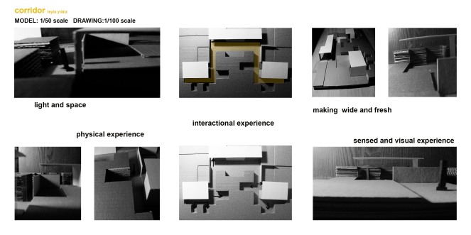
I tried to make a design fullfilling these three conditions. I designed two opposite landscapes. And each landscape has different functions in itself. For in-between conditions I made a corridor. So, it became an in-between space with the help of spatial experiences and relationships between two different landscapes. This in-between space created a combination and interaction with the side zones(landscapes). The corridor acted differently on the opposite landscapes because of their conditions. Surfaces of this corridor were created with different techniques. So, it had spatial experiences and qualities of these both landscapes, then it could become an in-between space. Additionally, generally common corridors are too narrow and closed. So, I decided to make a wide and open corridor by using transparent surfaces and open zones. Therefore, the experiences of two landscapes could be revealed. In this corridor, people can experience daylight and outside as visual. I considered to making a sense. It wasn’t a physical experience in every zones but mostly visual and auditory experiences.
Here, there are some photos of my model, diagrams and technical drawings.


